Every small B2B business owner has been seduced by it at least once.
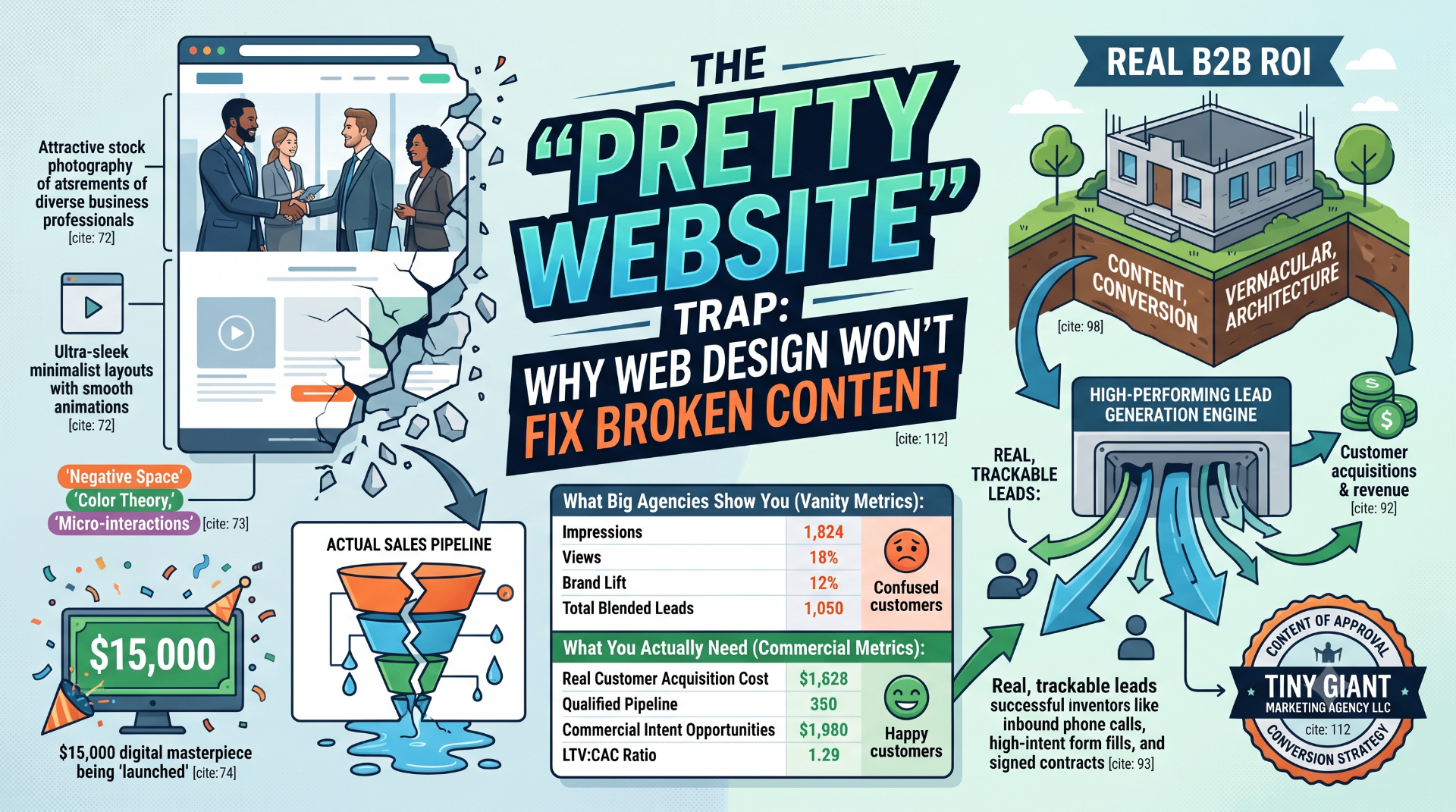
You sit down with a trendy graphic design agency. They show you a portfolio filled with ultra-sleek layouts, custom animations that slide across the screen like butter, and high-definition stock photos of impossibly attractive people shaking hands in glass boardrooms. They throw around design jargon like negative space, color theory, and micro-interactions.
It's captivating. You hand over a massive check, wait three months, and proudly launch your brand-new, $15,000 digital masterpiece.
Then, reality hits. Three weeks go by, and your phone doesn't ring. Your contact forms are empty, save for a few automated spam bots selling cryptocurrency. You call the design agency in a panic, and they tell you, "Well, the brand sentiment looks highly modern, and your visual engagement metrics are fantastic!"
Translation: Your website looks like a sports car, but it doesn't have an engine.
In the small business world, falling for the "pretty website" trap is one of the most expensive mistakes you can make. At Tiny Giant Marketing Agency LLC, we see it every single day. If your marketing firm focuses on the graphics before they nail down the strategy, you aren't building a business asset—you are paying for an incredibly expensive online brochure.
1. The Big-Agency Obsession with Aesthetics Over Conversions
Traditional, large-scale marketing firms love to focus on web design first because it is highly visual and easy to sell. It is much easier to get a client excited about a beautiful new logo or a flashy color palette than it is to do the heavy, gritty lifting of audience psychology and data tracking.
So, they build a gorgeous template. Then, right before launch, they realize they actually need words to fill the blank spaces on the screen. Their solution? They assign an intern or an automated AI tool to spit out generic corporate fluff.
You've seen these websites a thousand times. They are completely covered in meaningless buzzwords:
"We leverage cutting-edge, end-to-end paradigm solutions to synergize your operational ecosystem."
What does that even mean? No human being has ever woken up at 3:00 AM stressed about their "operational ecosystem." If a facility manager is searching for an industrial electrical contractor or an emergency service provider, they want to know three things in under three seconds: What do you do, how does it solve my specific problem, and what do I click to hire you? When you run paid ad traffic to a website built by designers who don't understand lead capture, you get a beautiful bounce rate and a cleared-out bank account. As we emphasized in our breakdown of How to Measure the Real ROI of Your B2B Marketing Spend, you cannot deposit visual aesthetics at the bank. Phones ringing, forms filling, and contracts signing are the only design elements that actually matter to your bottom line.
2. Our Order of Operations: Conversion Architecture First, Design Second
You would never hire a builder to pick out the paint colors and kitchen tile before an architect engineered the foundation of your house. Yet, that is exactly how most businesses approach web design.
At Tiny Giant Marketing Agency LLC, we completely reverse the corporate agency playbook. We focus entirely on the content, vernacular, and conversion rates first, long before a single graphic is ever rendered or a line of code is written.
Step 1: Lock in the Customer's Vernacular
Before we think about layout, we study your market-preferred customer. We figure out exactly how they speak, how they frame their problems, and what specific anxieties keep them from buying. If your website text doesn't strike the exact vernacular of your target customer, visitors will bounce in seconds flat, no matter how pretty the background video is. We write high-converting copy that addresses real-world pain points in plain, no-nonsense English.
Step 2: Engineer the Conversion Path
We don't guess where buttons should go based on "artistic intuition." We utilize the strict Meclabs Conversion Heuristic formula to map out the psychological journey a user takes from the split-second they land on your page:
- Amplifying Motivation: Aligning the page headlines with the exact structural reason the buyer searched for you in the first place.
- Clarity of Value Prop: Ensuring your unique edge—like our zero-contract model—is visible instantly.
- Eliminating Friction: Systematically deleting clunky multi-step forms, slow-loading animations, and confusing navigation paths.
- Extinguishing Anxiety: Neutralizing their fear of getting ripped off by replacing generic stock photos with clear, authentic proof and transparent service descriptions.
We ensure that every single headline, bullet point, and call-to-action button is mathematically positioned to guide the user toward picking up the phone or booking an appointment.
Step 3: Wrap It in Functional Design
Only after the messaging is bulletproof, the copy is written, and the conversion architecture is locked in do we bring in the visual elements. Why? Because design should always serve the content, never the other way around. Graphic design's only job on a small business website is to make your authoritative messaging easy to read, trust, and act upon.
The Tiny Giant Difference: High Performance without the Fluff
The corporate agency model is broken because it prioritizes creative vanity over client profitability. They want to win design awards to show off to their peers; we want to build marketing pipelines that help you scale your operations.
Because Tiny Giant Marketing Agency LLC operates as an agile, boutique firm, we don't force you into bloated, pre-packaged design retainers that drain your cash flow during slower quarters. We employ an incremental service approach, tailoring your digital footprint to match your staff's actual capacity and your industry's seasonal fluctuations.
We back up this conversion-first philosophy with total, unapologetic accountability: transparent pricing, certified digital expertise, and absolutely zero long-term contract lock-ins. We don't need to trap you in a 12-month legal chokehold to keep your business. If our content and conversion strategies aren't driving real, trackable pipeline growth month-over-month, you have the absolute freedom to walk away. Imagine that—an agency that actually has to perform to get paid.
Is Your Website an Asset or an Art Project?
If your website looks stunning but your sales team is sitting around waiting for the phone to ring, your conversion architecture is broken. It's time to stop paying for graphics and start investing in revenue.
Let's find out exactly where your website is leaking money. Contact Tiny Giant today for a Free, No-Obligation Digital Audit. We'll take a look under the hood of your current site, critique your content, and give you a clear, fluff-free blueprint on how to turn your digital footprint into a high-converting lead machine. No long-term contracts. No artsy excuses. Just real strategy.
Need help building your strategy?
Talk to our team about a marketing plan that fits your goals.